October 24–December 5, 2026
Opening reception: October 24, 2:00 pm to 5:00 pm
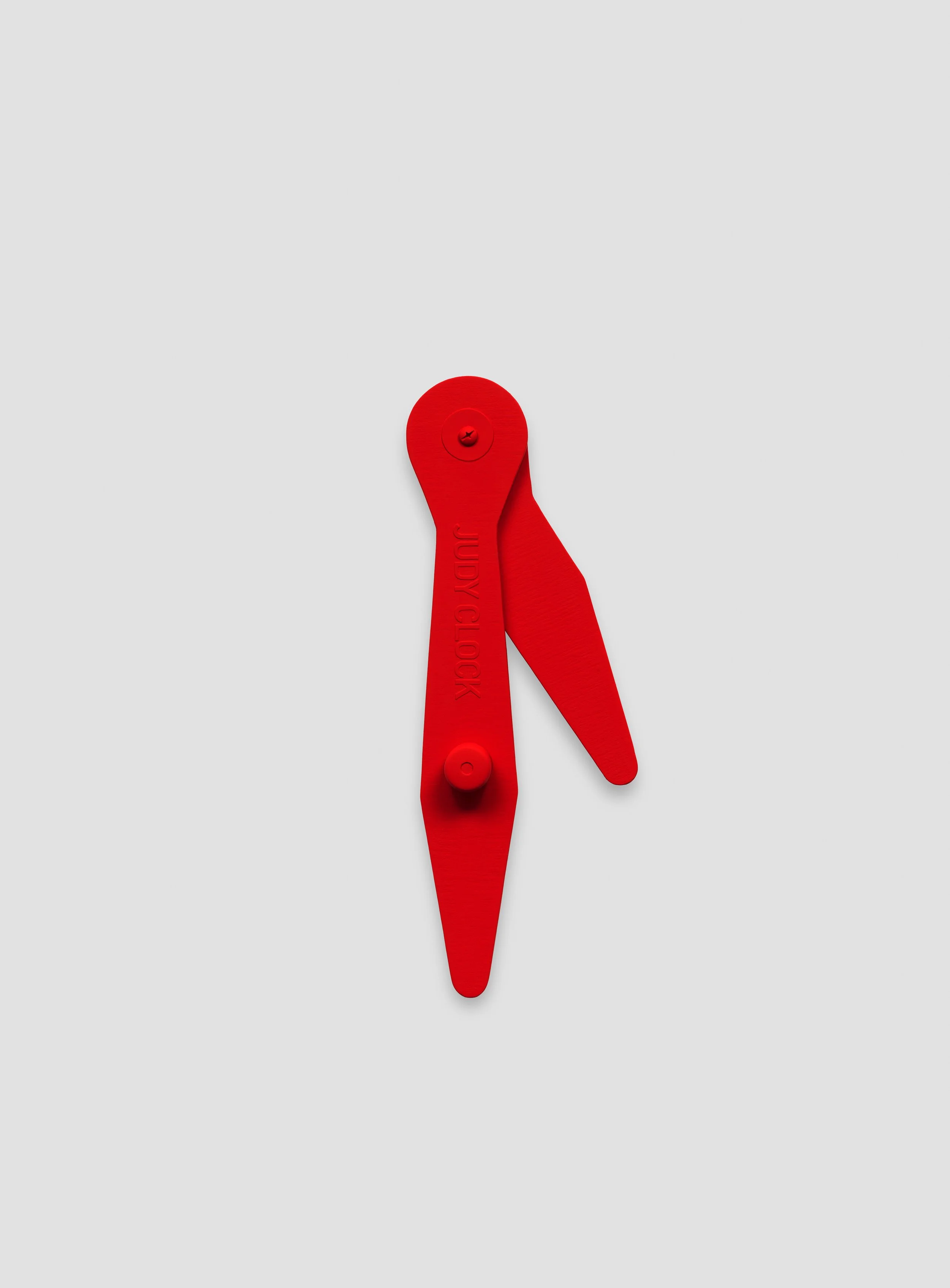
We are pleased to announce “Kristopher Raos: Blink and you’ll miss it.” The exhibition coincides with “Walter Wittel: Before-After.” Please join us for an artists’ reception on Saturday, October 24 from 2-5 pm. The two exhibitions will remain on view through December 5 at as-is.
Here as in exhibitions before, Raos establishes a tense dialectical relationship between his chosen forms and his chosen content. Bright and sharp (if sometimes subtle) colors are applied with hard edge precision to canvas painting supports of various shapes and sizes and then distributed around the gallery with the sure hand of someone who knows the exhibition space and how to maximize it for dramatic effect. Each individual painting is an exploration of the interlocking relationship between fine art and graphic design history, the latter a topic of growing interest to painters, conceptual artists and art historians alike and a territory through which this largely self trained artist moves with notable confidence. And while the artworks are easily identified as paintings operating within the painting discourse, they sometimes take on object qualities—in one case a painting, Untitled (Bent, Not Broke(n)), wraps around a corner while another, Untitled (So what you sayin Todd? Time to Come Up), forms the free-floating hands of a clock. In yet other cases shallow embossed elements appear just beneath the otherwise smoothly painted surfaces they only slightly disrupt.
Always however Raos’ inventive formal gestures are enlisted in the service of meaningful themes that give these already alluring images and objects an added degree of urgency, his Untitled (Hit the curb to make the Bread thicker, 2 for 5’s) being a case in point. This graphic representation of the familiar Wonder Bread package is a barely coded reference to the artist’s financially precarious childhood, reliant on low cost food outlet stores and on an already fraying social safety net that has gotten only more tattered in the decades since. Acknowledging this darker critical context as he does and then wrapping it in the bright affirmative colors of American mid-century package design gives this and other of his paintings a political valence that distinguishes them from the vintage Pop and Minimalism they might otherwise resemble while leveraging those still potent art styles to make a rather more subversive point about art and politics. And what better moment for this lesson to arrive than now?